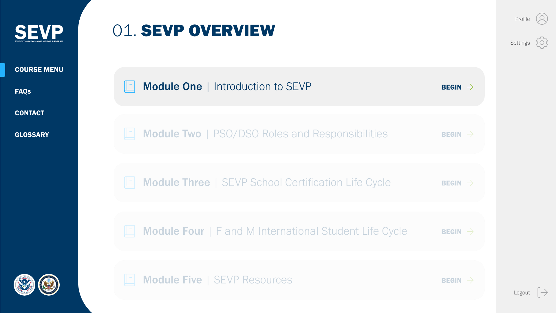
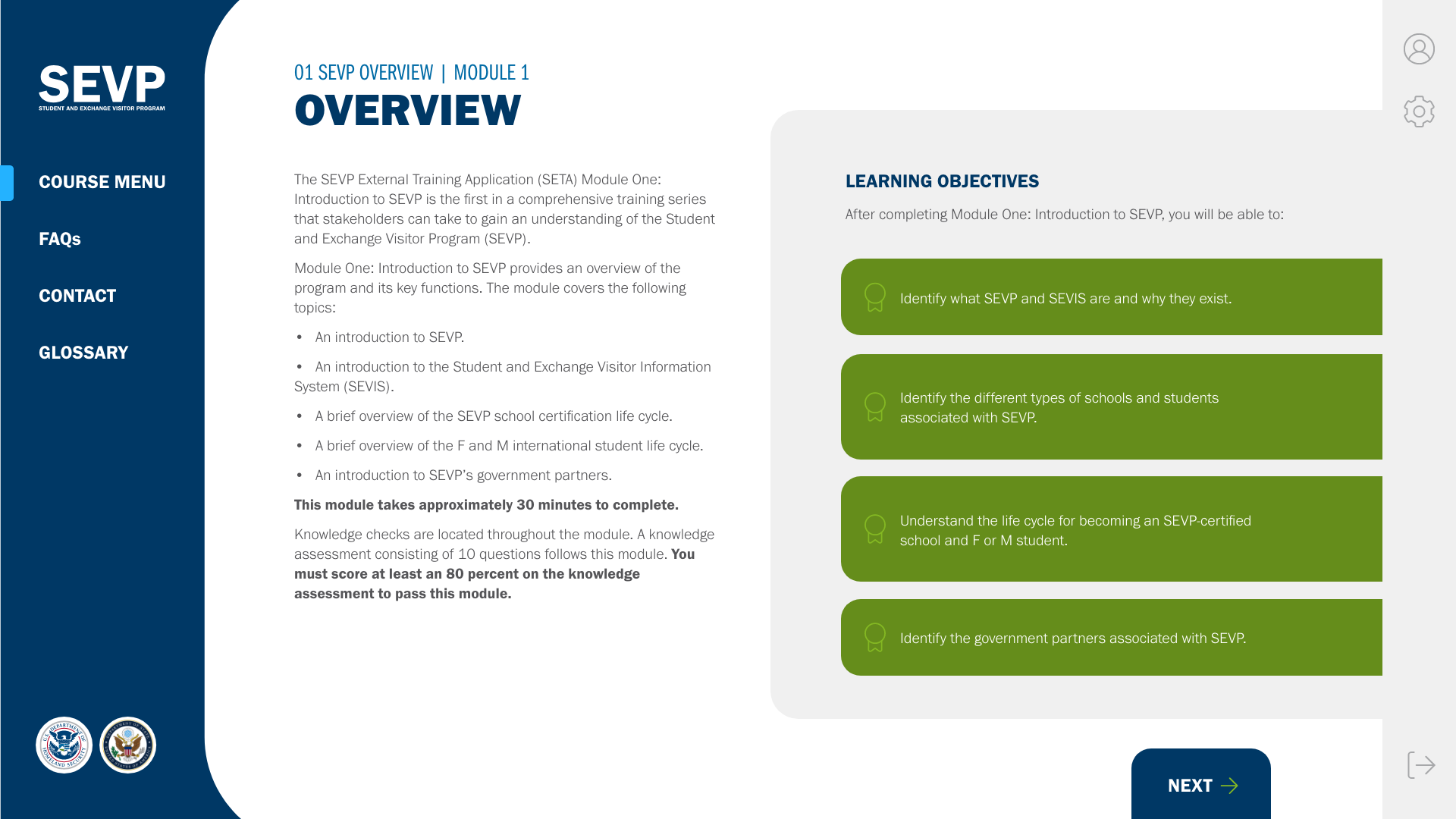
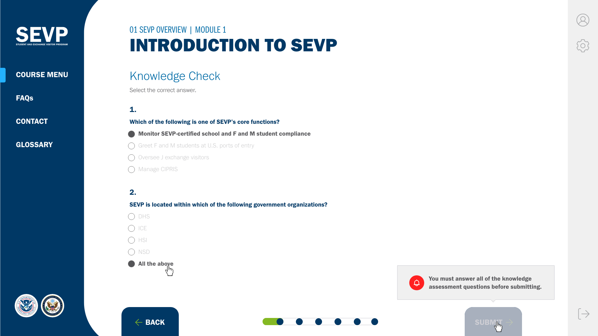
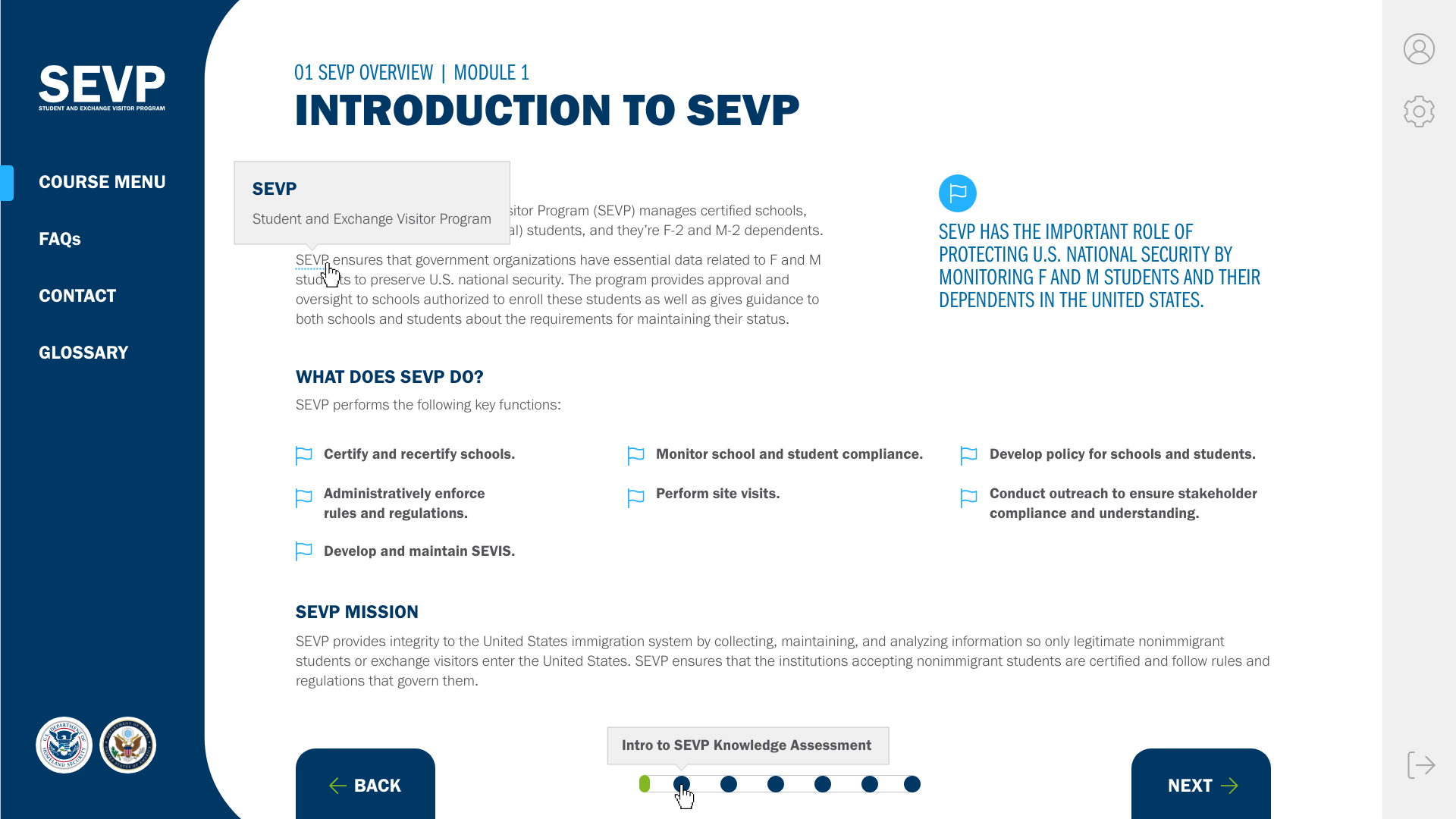
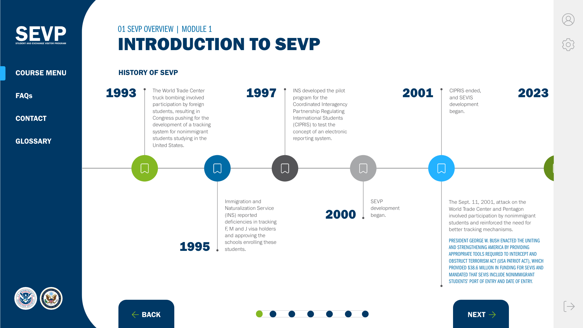
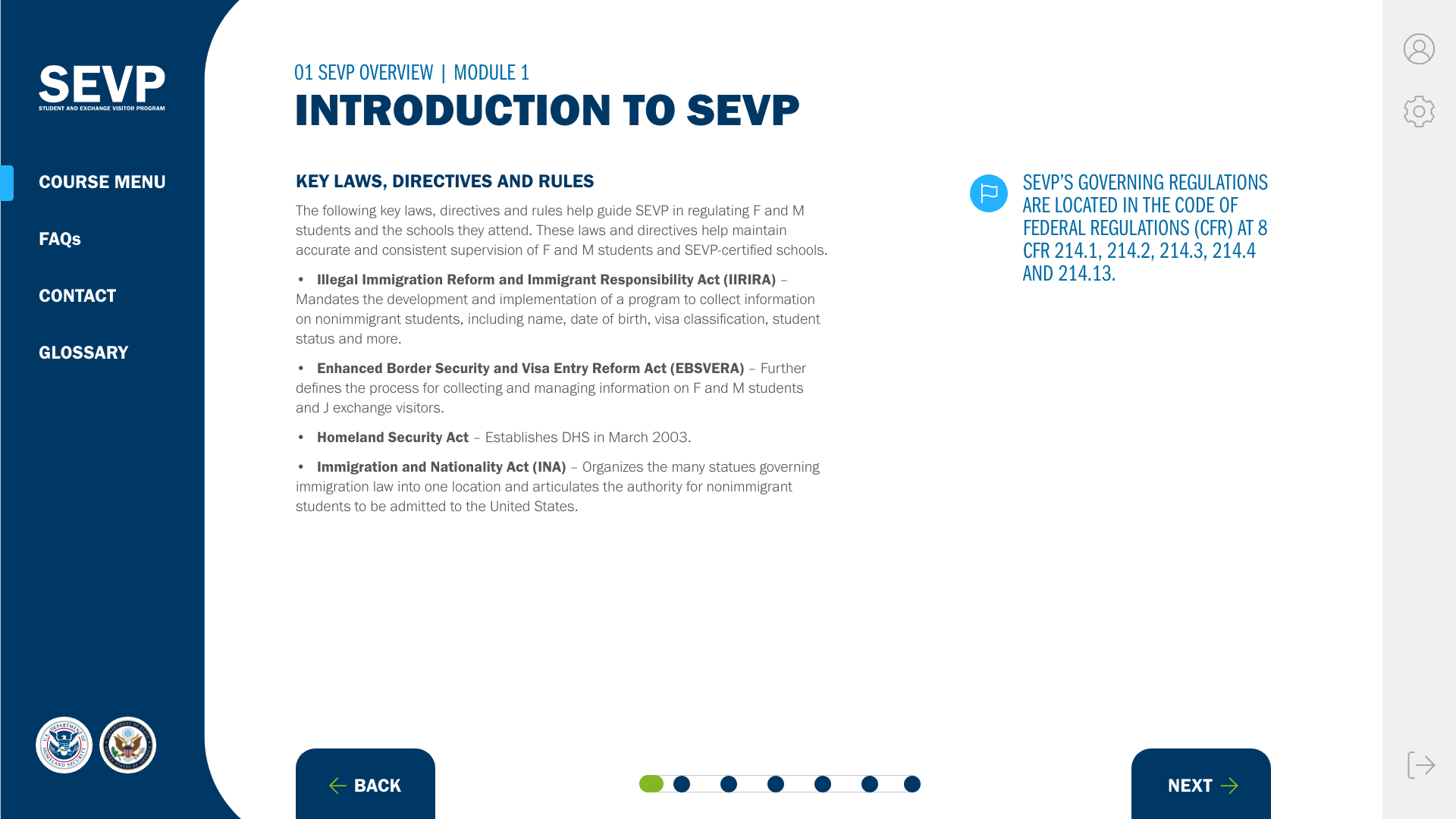
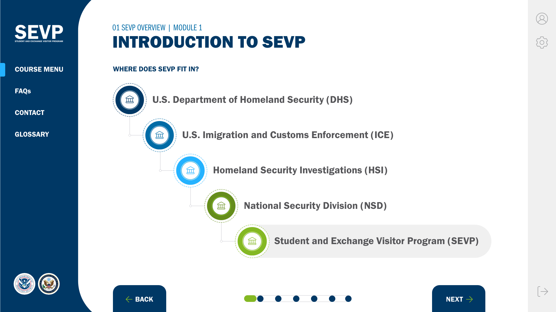
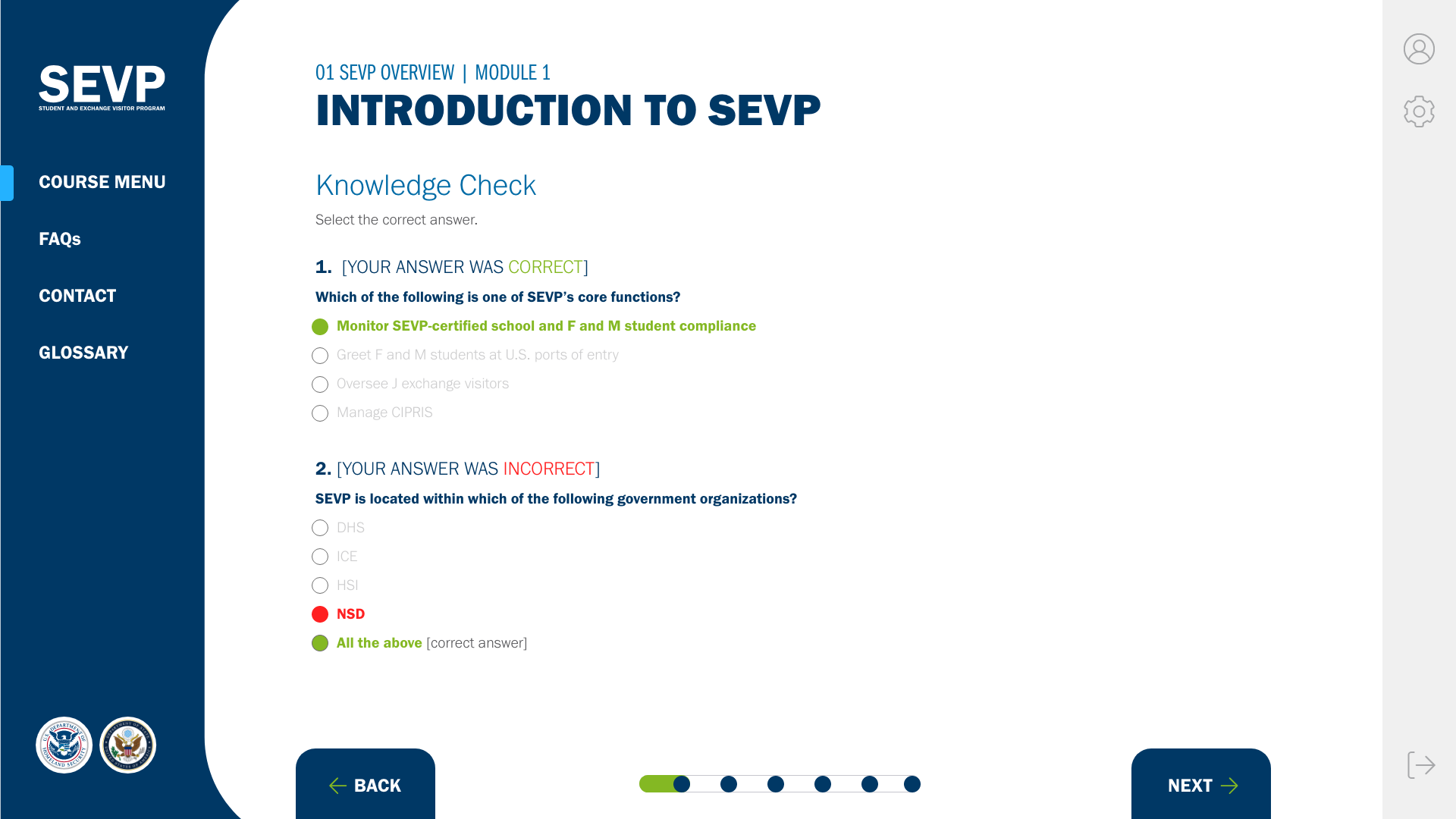
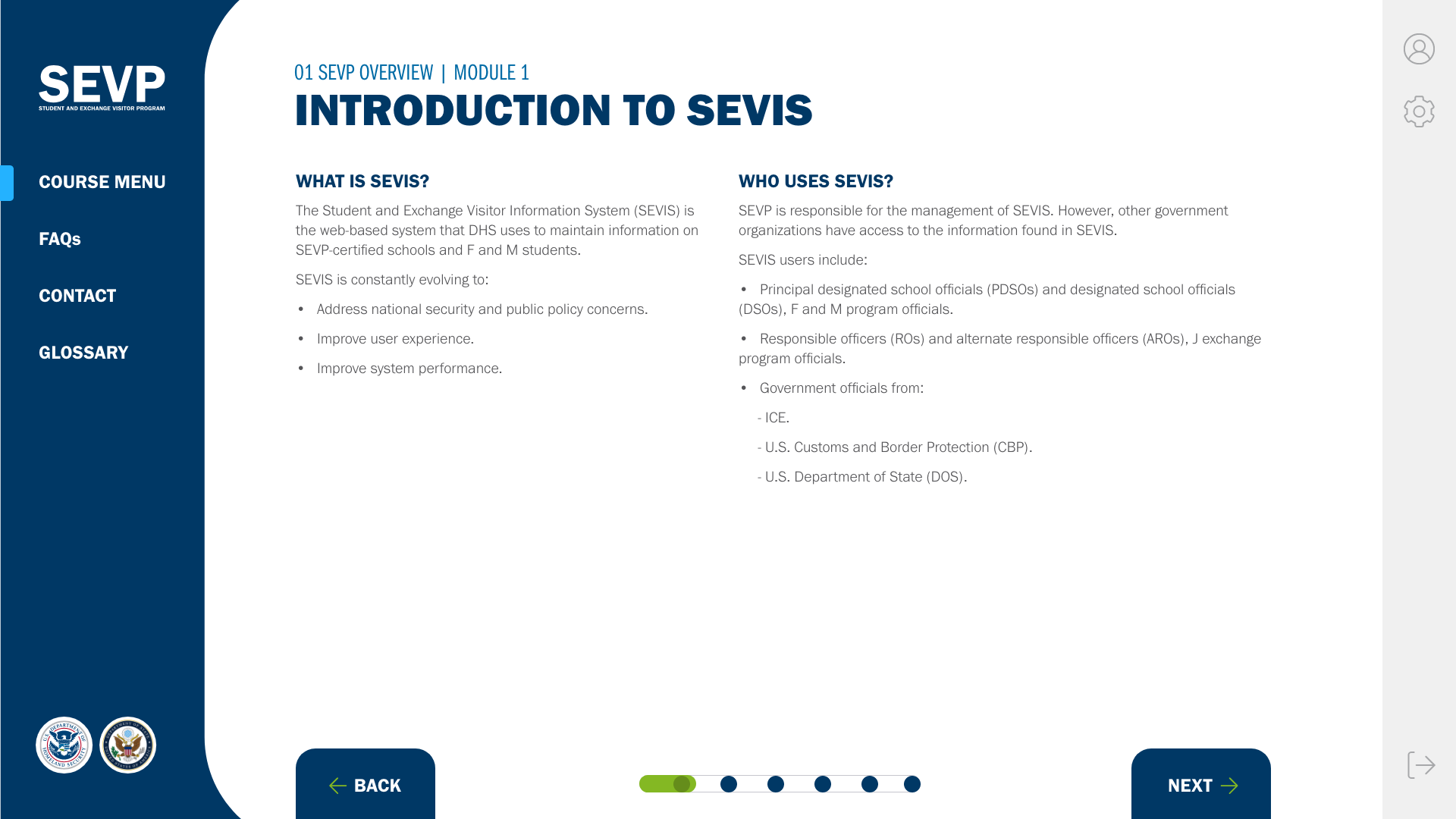
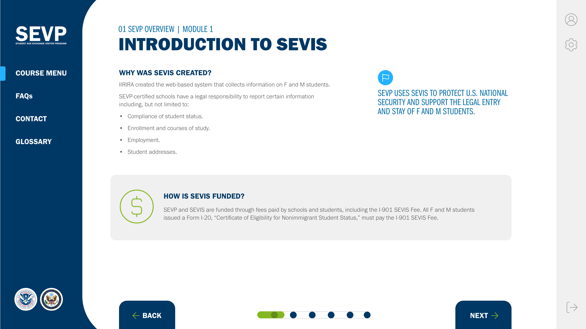
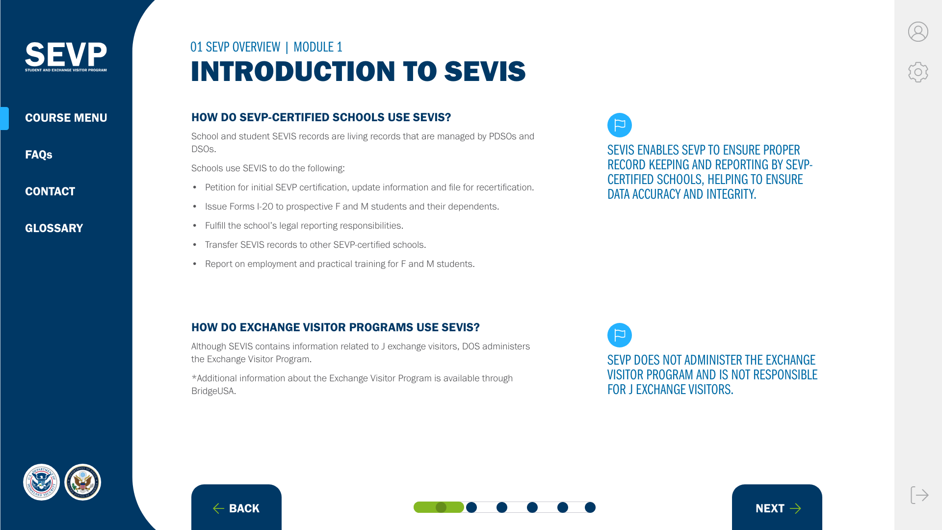
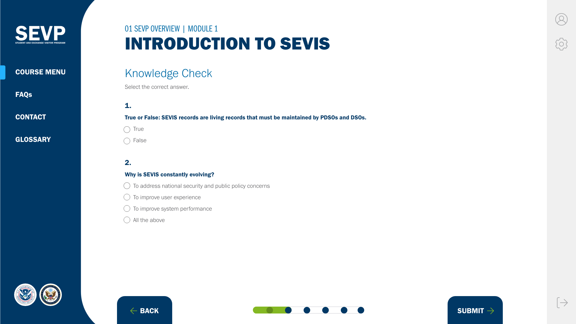
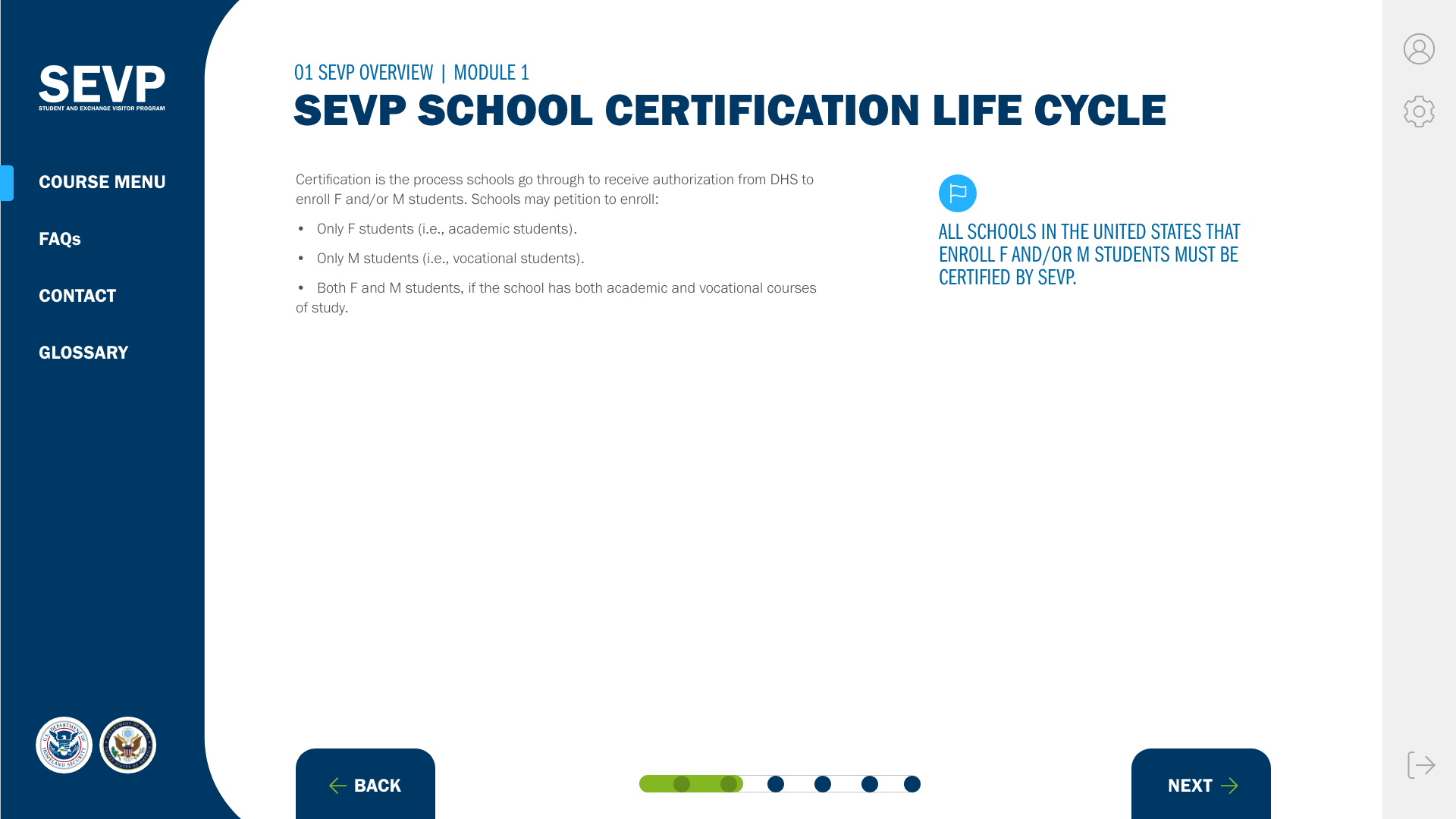
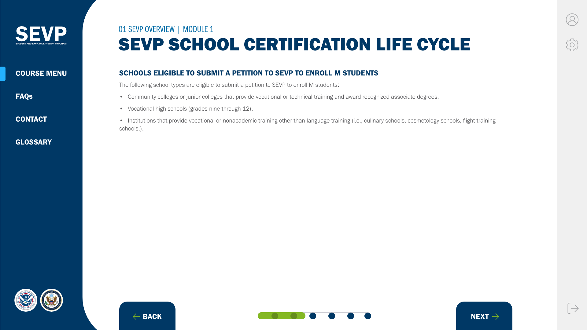
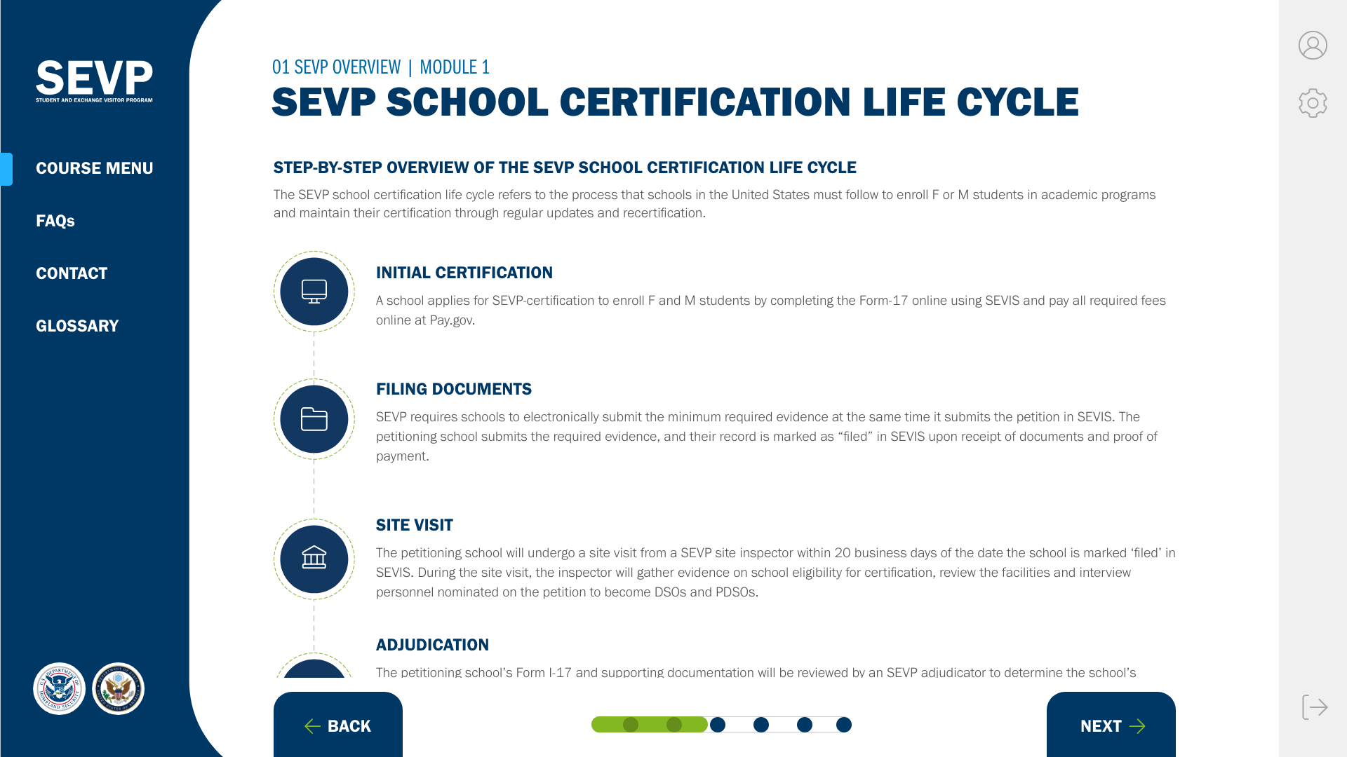
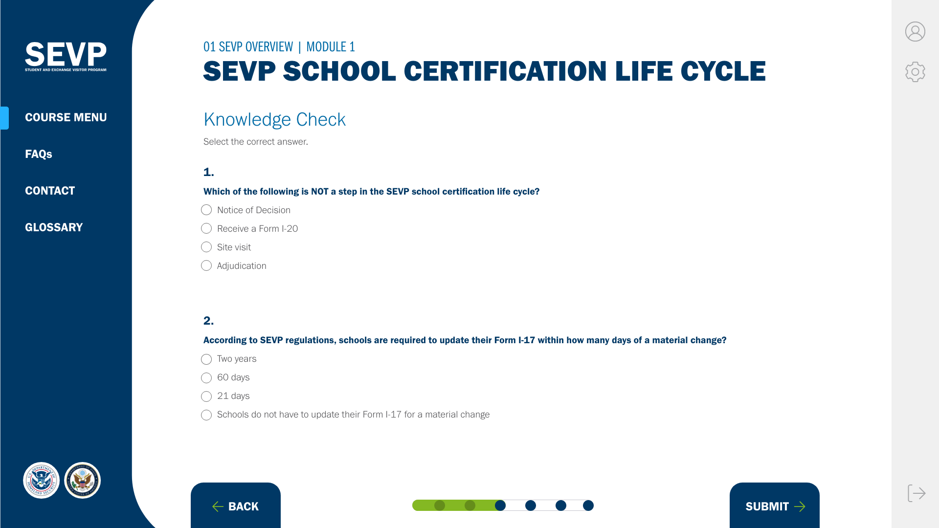
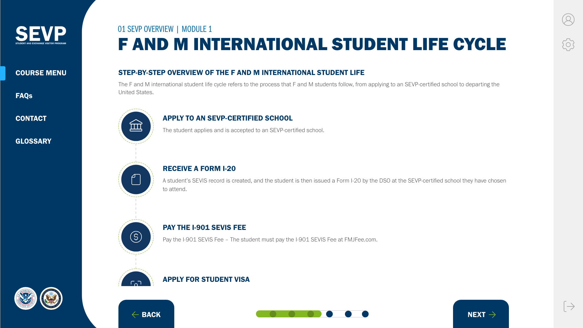
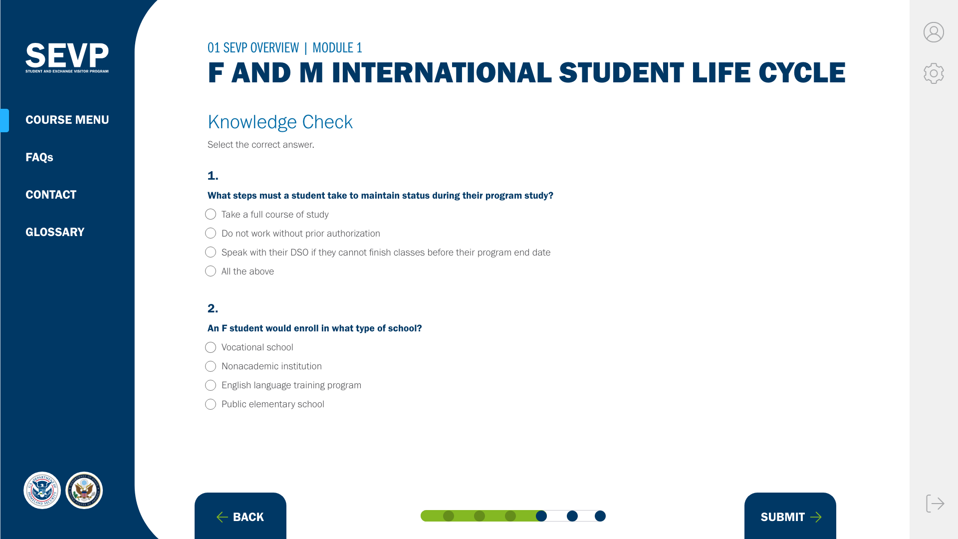
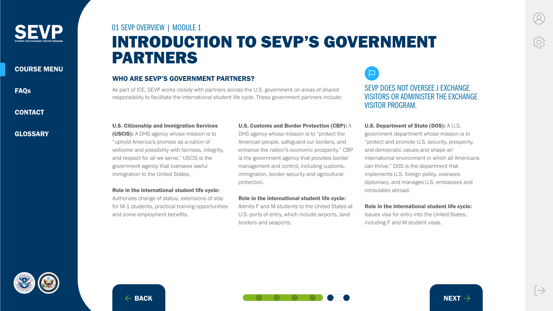
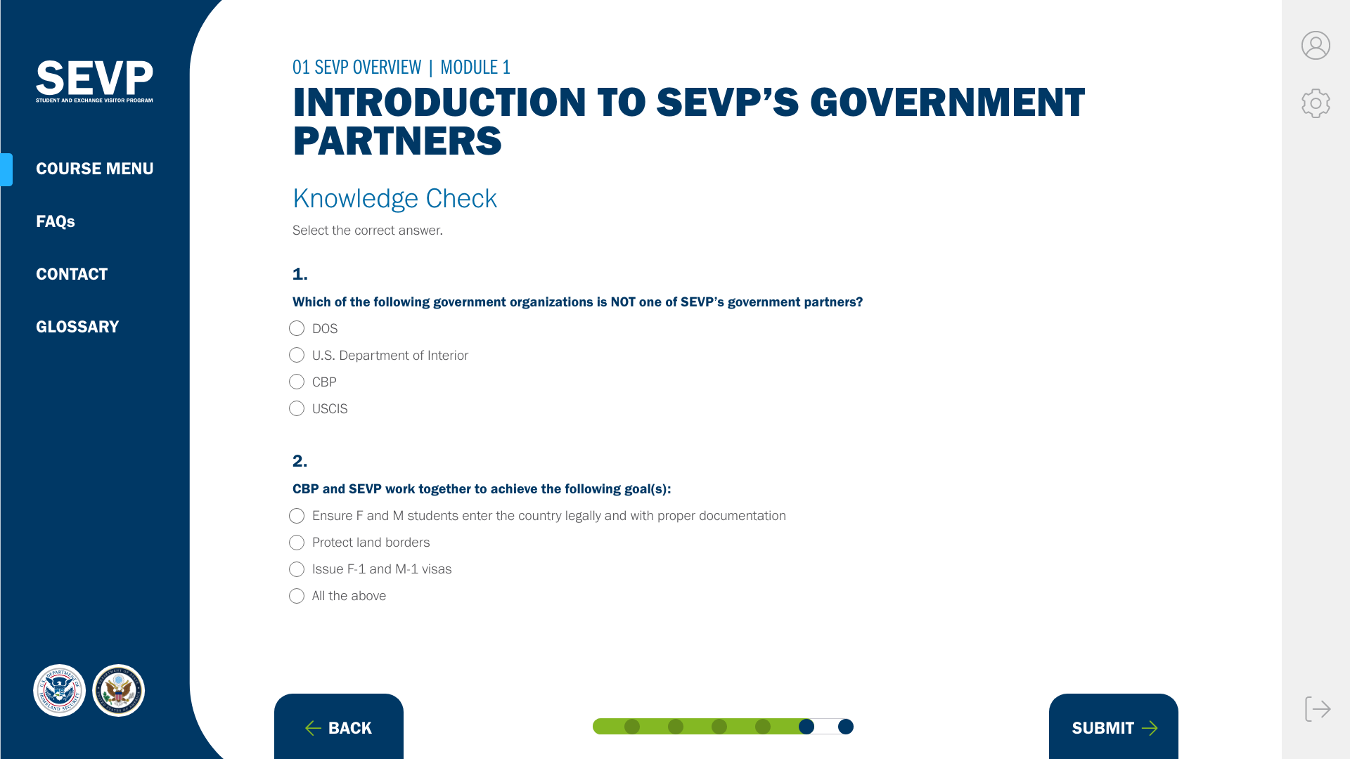
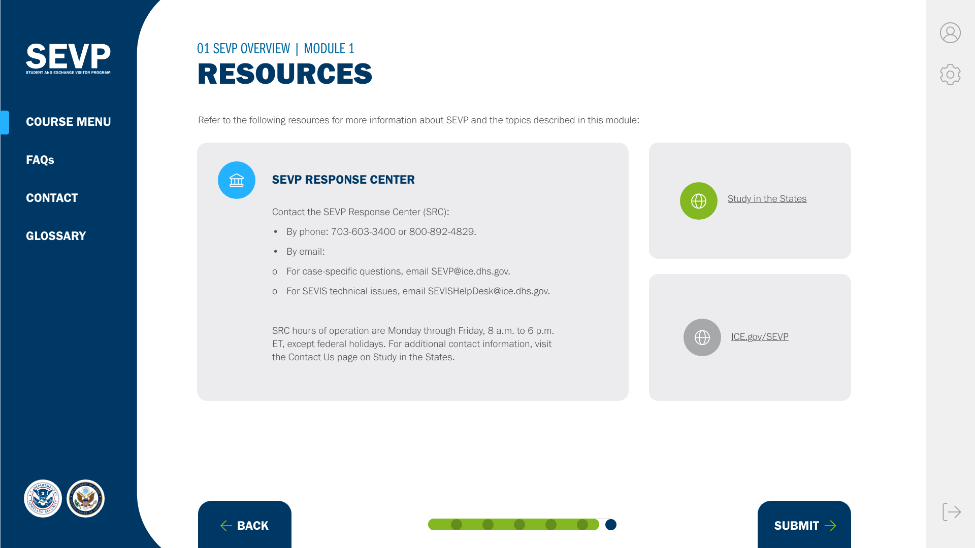
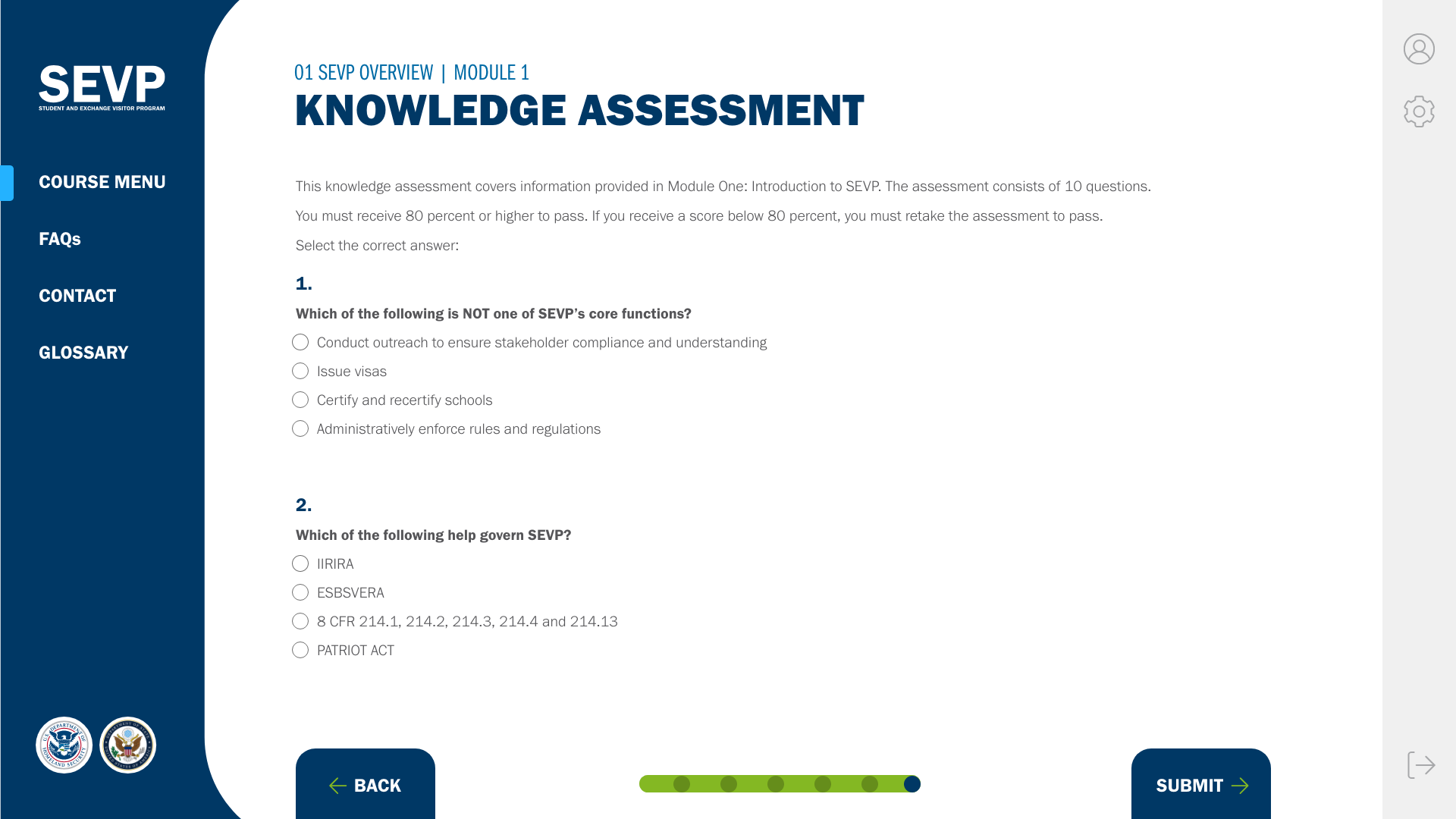
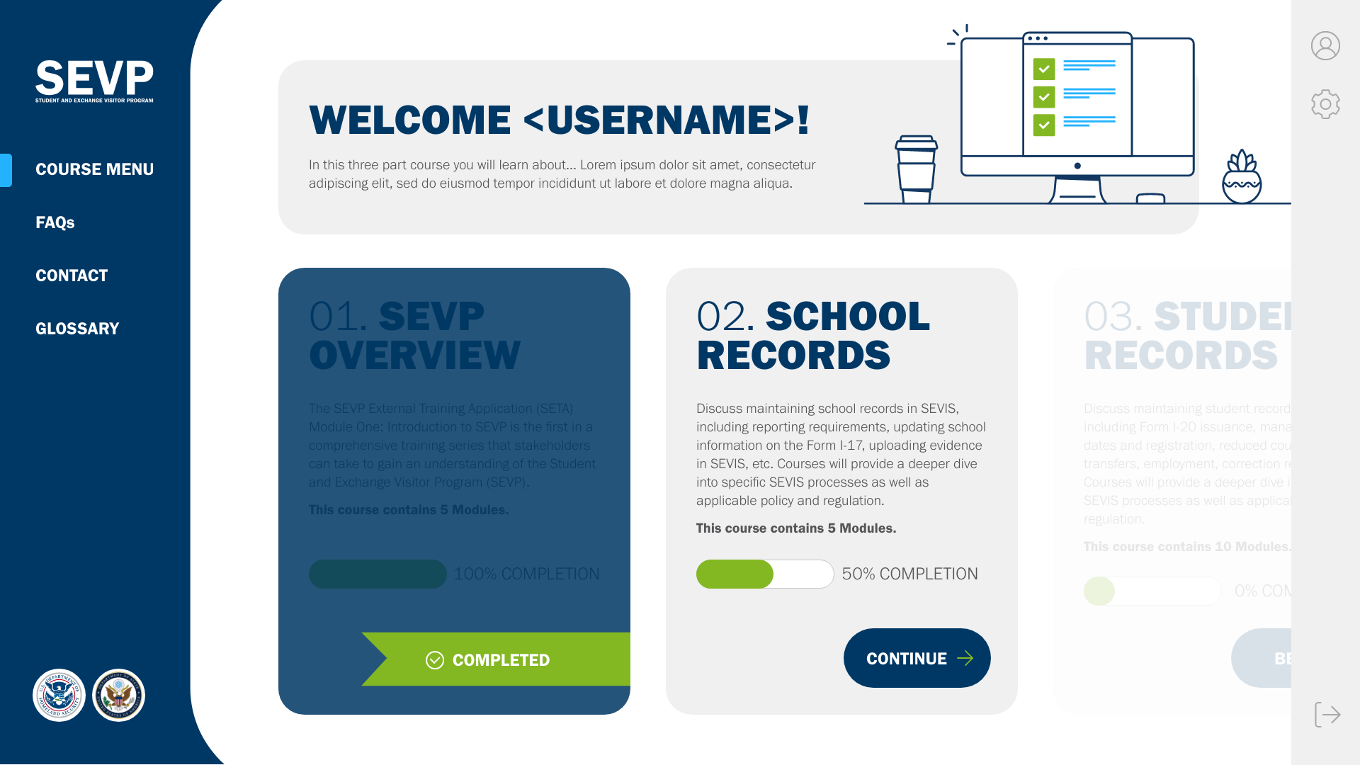
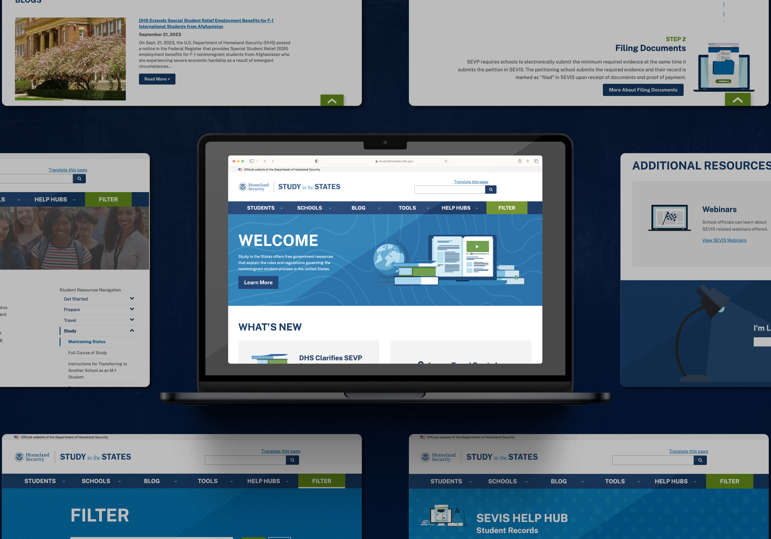
The Student Exchange and Visitor Program (SEVP), a major component of national security under the Department of Homeland Security (DHS) allowed me my first venture into web design in my career. Early in my tenure, I led design efforts during a critical transition, migrating the Study in the States website from Drupal 8 to Drupal 9. Simultaneously, I reimagined the user experience, setting a new trajectory for sentiment within the program. Throughout my tenure, I've crafted many resourceful PDFs and established an efficient social graphic library, assisting my team in social calendar planning. Additionally, in the past year I eagerly developed a redesign of the SETA online training course, rethinking the entire structure to better align with their audiences’ goals, as well as their goals as a program.
ART DIRECTION | LAYOUT | UX & UI
Site Mapping
Here I take inventory of the existing user experience, take note of gaps and potential friction points, then reimagine a cleaner site architecture and user journey.
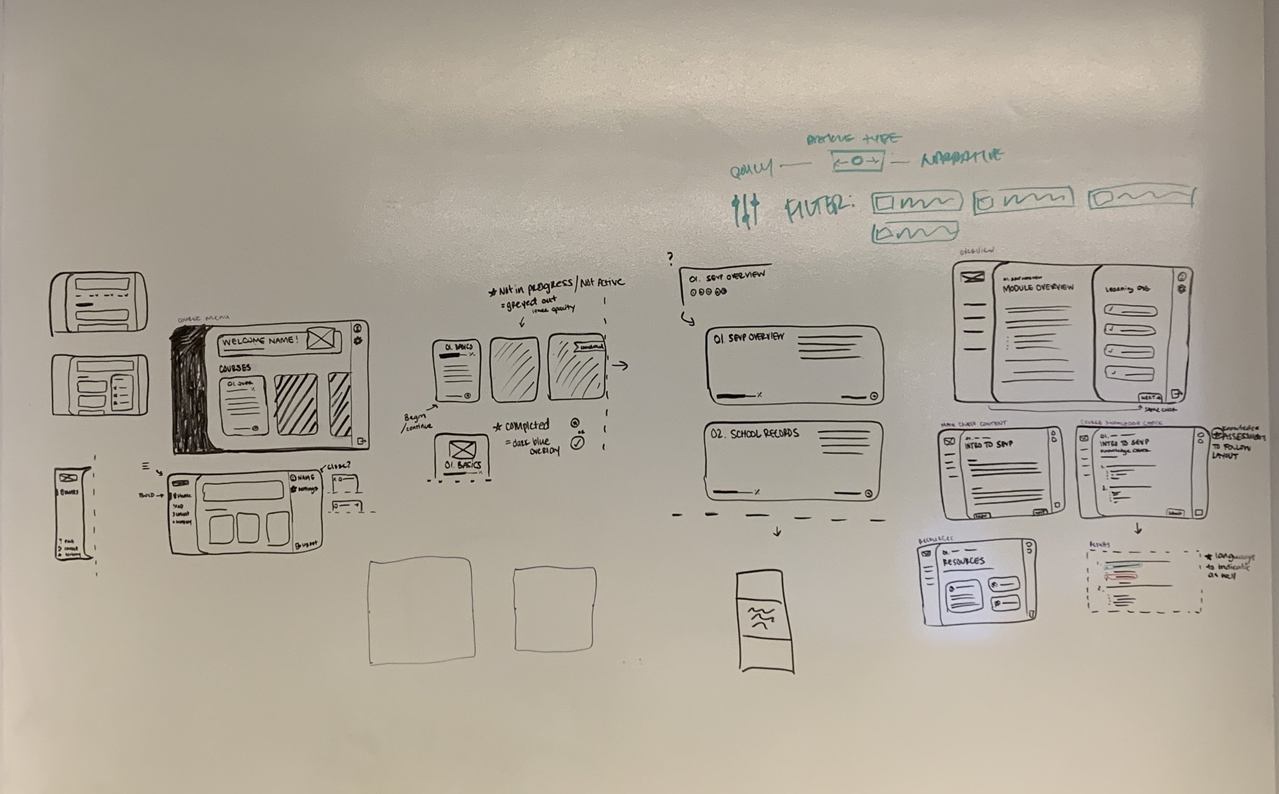
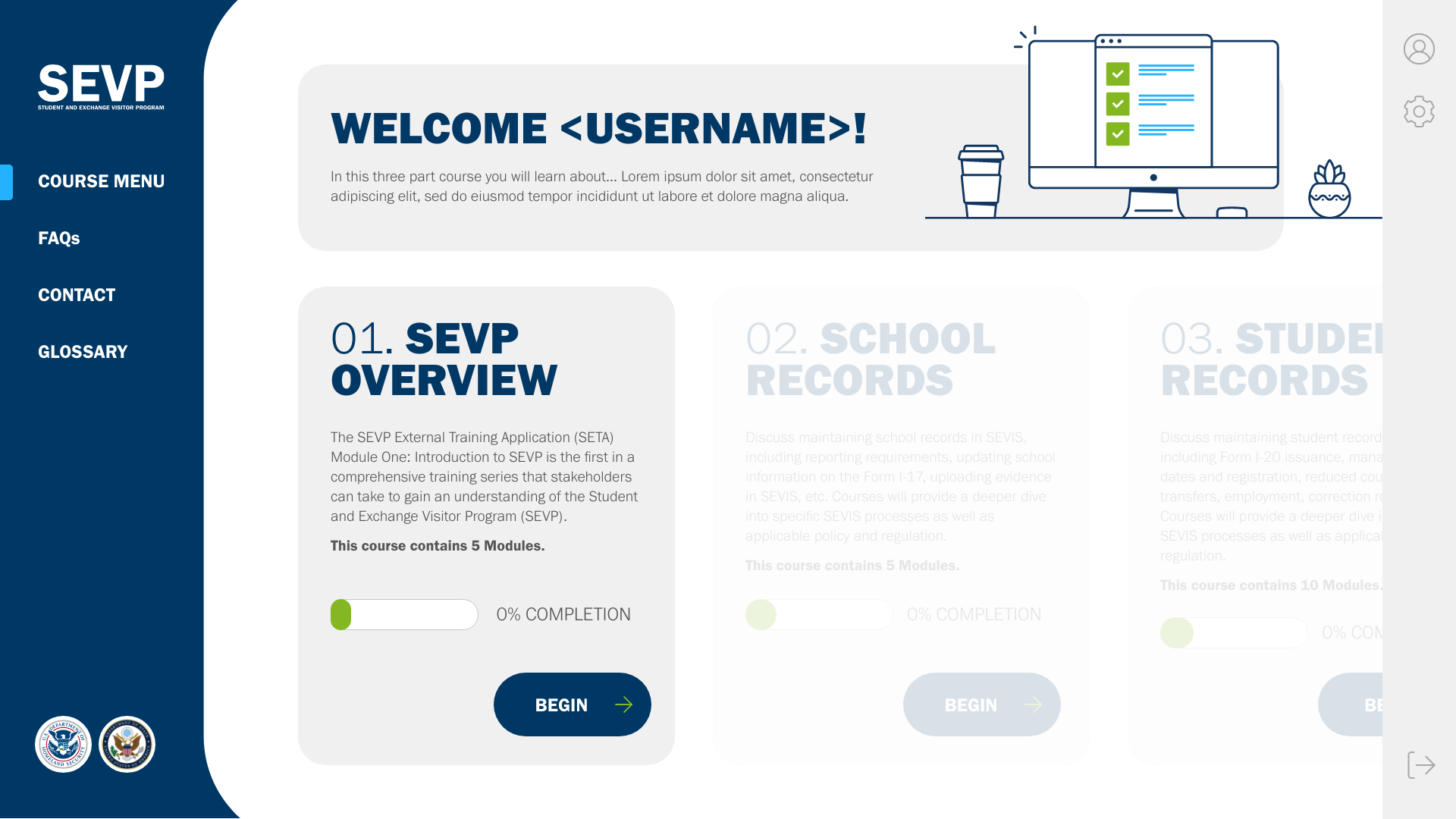
Wireframing
At this stage I’m exploring the bare bones of how to layout and structure the design of the product, still keeping site architecture and user flow top of mind in how a user will need to navigate around.




![Menu - Modules [if needed].png](https://images.squarespace-cdn.com/content/v1/5b917021620b85f16aea458a/1699830458652-N40EPCCPSNM5KWV1UIBW/Menu+-+Modules+%5Bif+needed%5D.png)
